Color Psychology in Golf Course Branding
How to choose colors that reflect your course's personality and appeal to your target demographic. Understanding the emotional impact of color choices for effective golf course branding.
Understanding Color Psychology
Color psychology is the study of how colors affect human behavior and emotions. In golf course branding, the right color palette can communicate your course's values, attract your ideal players, and create memorable experiences that keep golfers coming back.
Every color evokes specific emotions and associations. Understanding these connections helps you make intentional design choices that resonate with golfers and reinforce your brand identity. Whether you're designing a custom scorecard layout or refreshing your entire course branding, color selection is foundational.
Color Wheel Basics for Scorecard Design
Understanding the color wheel is essential for creating harmonious scorecard designs. The color wheel organizes colors by their relationships, making it easier to select palettes that work together.
Primary Colors
Red, blue, and yellow form the foundation of the color wheel. These cannot be created by mixing other colors. In golf branding, blue is the most commonly used primary color due to its associations with trust and stability.
Secondary Colors
Green, orange, and purple are created by mixing primary colors. Green (blue + yellow) is naturally associated with golf courses, making it a popular choice for scorecard design.
Tertiary Colors
These intermediate colors offer nuance and sophistication. Teal (blue-green), chartreuse (yellow-green), and burgundy (red-purple) can help your scorecard stand out while maintaining elegance.
Traditional Golf Colors
Certain colors have become synonymous with golf through tradition and natural association with the sport.
Green - The Foundation Color
- Associations: Nature, growth, harmony, freshness, calm
- In Golf: Represents the course itself, tradition, prestige
- Best For: Traditional clubs, championship courses, courses emphasizing natural beauty
- Shades: Forest green (classic authority), Kelly green (vibrant energy), Sage (sophisticated subtlety), Hunter green (timeless elegance)
Gold - Luxury and Achievement
- Associations: Success, quality, warmth, value, prestige
- In Golf: Premium experience, championship heritage, winning
- Best For: Private clubs, resort courses, tournament venues
- Combinations: Pairs beautifully with deep greens, navy blue, and black
Color Meanings in Golf Context
Each color carries specific psychological weight that can enhance or detract from your course's message. Understanding these meanings helps you craft a scorecard color scheme that communicates exactly what you intend.
Blue - Trust and Stability
- Navy Blue: Authority, tradition, exclusivity - ideal for established private clubs
- Sky Blue: Openness, relaxation, accessibility - perfect for public courses
- Teal: Modern, refreshing, coastal feel - great for seaside or contemporary courses
- Perfect for courses emphasizing reliability, heritage, and trust
Earth Tones - Natural Elegance
- Brown: Stability, reliability, organic authenticity
- Tan/Beige: Warmth, simplicity, perfect for desert courses
- Terracotta: Rustic charm, southwestern appeal
- Ideal for courses emphasizing natural landscape integration
Bold Colors - Modern Energy
- Red: Energy, excitement, competitive spirit - use sparingly as accent
- Orange: Enthusiasm, creativity, fun - great for casual or family courses
- Purple: Luxury, creativity, uniqueness - differentiates upscale experiences
- Use as accents (10% of palette) to avoid overwhelming the design
Contrast and Readability for Outdoor Use
Scorecards are used outdoors in variable lighting conditions - from bright midday sun to overcast skies to shaded cart paths. Proper contrast ensures your scorecard remains functional regardless of conditions.
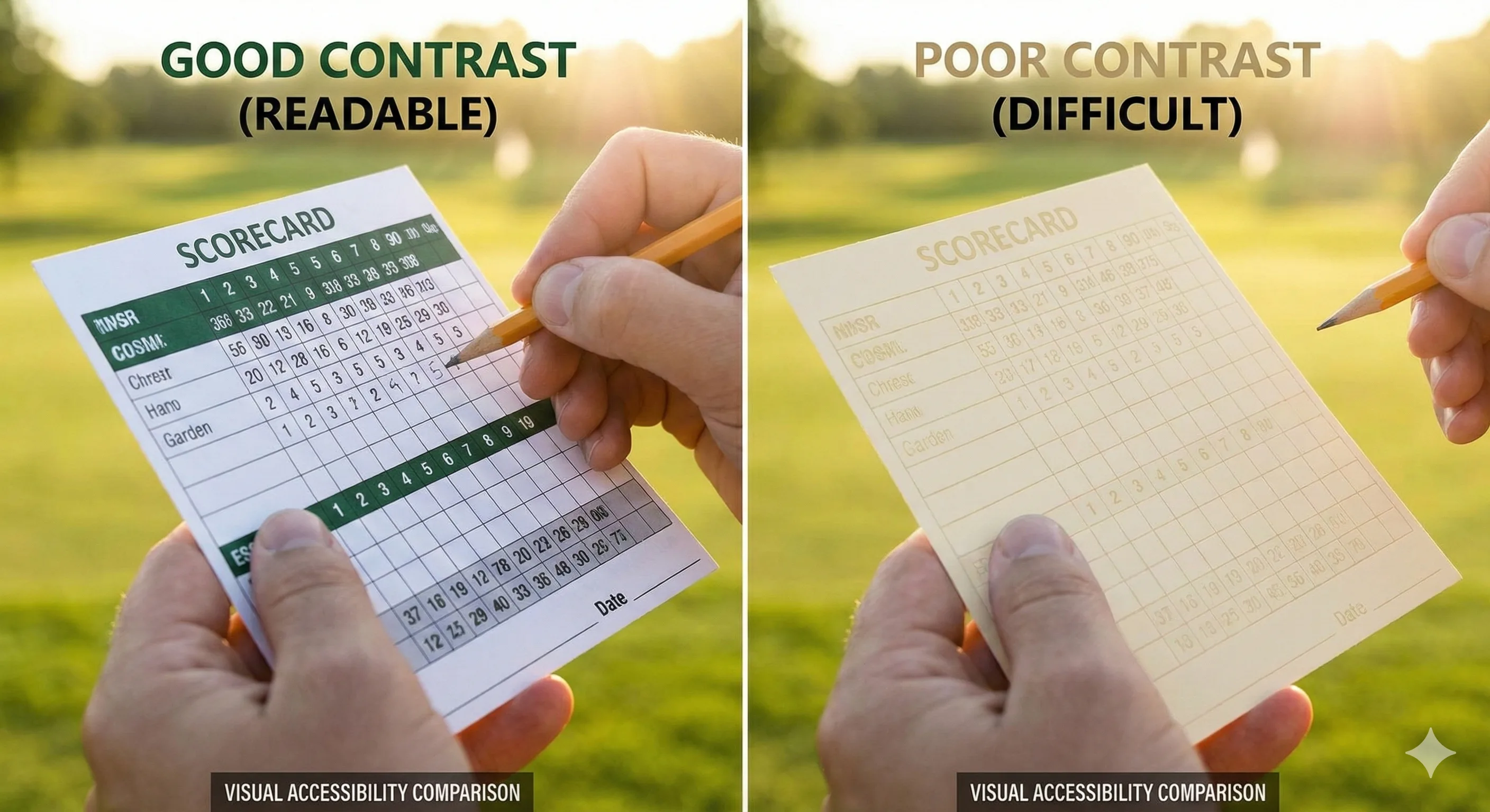
Understanding Contrast Ratios
The Web Content Accessibility Guidelines (WCAG) recommend a minimum contrast ratio of 4.5:1 for normal text and 3:1 for large text. For outdoor scorecard use, aim even higher:
- Score entry boxes: Minimum 7:1 contrast ratio
- Hole numbers and yardages: Minimum 4.5:1 contrast ratio
- Course name and headers: Minimum 3:1 contrast ratio
Bright Sunlight Considerations
Direct sunlight washes out colors significantly. Design for worst-case:
- Avoid light gray text on white backgrounds - invisible in bright sun
- Dark text (black, dark navy, dark green) on light backgrounds works best
- Light text on dark backgrounds can cause glare - test your combinations
- Matte paper finishes reduce glare compared to glossy options - see our paper guide for details
Testing Your Color Choices
Before finalizing your scorecard design:
- Print a proof on your chosen paper stock
- Take it outside at midday on a sunny day
- Test reading from typical scorecard distance (arm's length)
- Check readability in shade (under a cart roof or tree)
- Have golfers over 50 test readability - aging eyes need higher contrast
Color Combinations That Work Well
These proven golf scorecard color combinations balance tradition, readability, and visual appeal.
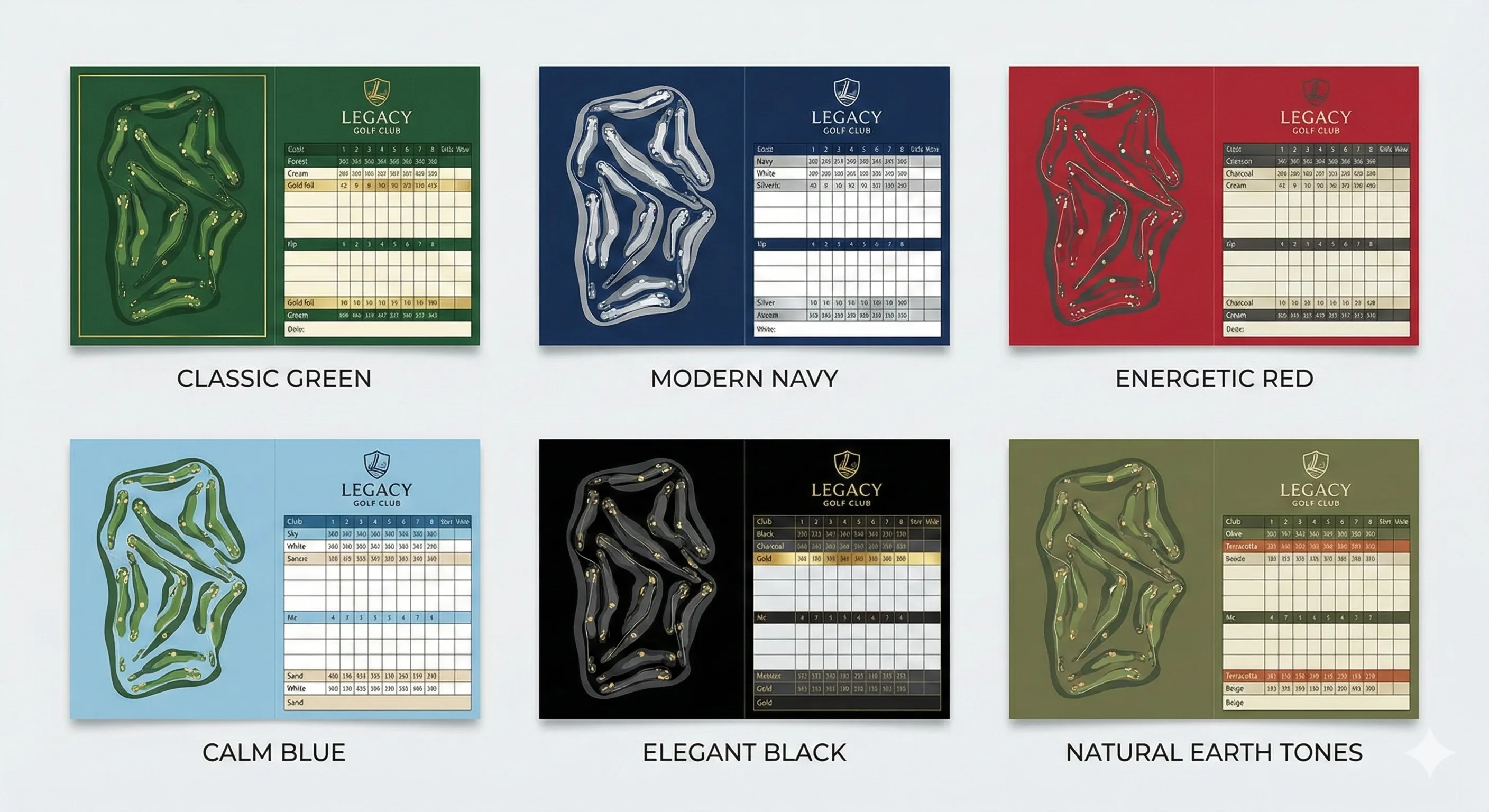
Classic Championship Combinations
- Forest Green + Gold + Cream: Augusta-inspired elegance, timeless appeal
- Navy Blue + White + Gold: Prestigious, trusted, country-club feel
- Hunter Green + Burgundy + Tan: Rich, traditional, British links style
Modern Contemporary Combinations
- Charcoal + Lime Green + White: Fresh, energetic, appeals to younger golfers
- Navy + Coral + Sand: Coastal, resort feel, warm and inviting
- Black + Silver + Teal: Sleek, premium, modern minimalism
Regional Theme Combinations
- Desert Courses: Terracotta + Sage + Sand
- Mountain Courses: Pine Green + Stone Gray + Sky Blue
- Coastal Courses: Ocean Blue + Sand + Coral
- Links Courses: Heather Purple + Olive + Cream
Accessibility: Designing for Colorblind Golfers
Approximately 8% of men and 0.5% of women have some form of color vision deficiency. Creating an accessible scorecard ensures all your golfers can use it effectively.
Common Types of Color Blindness
- Deuteranopia (red-green): Most common; affects red, green, and brown perception
- Protanopia (red-green): Red appears darker, similar to deuteranopia
- Tritanopia (blue-yellow): Rare; blue appears greenish, yellow appears pink
Accessible Design Strategies
- Never rely on color alone: Use patterns, labels, or icons alongside color
- Avoid red-green only distinctions: Don't use red for over-par and green for under-par without additional indicators
- Use high contrast: Colorblind users rely more heavily on value contrast (light vs. dark)
- Test with simulators: Tools like Coblis or Color Oracle show how your design appears to colorblind users
Colorblind-Safe Palette Options
These color combinations work well for most forms of color blindness:
- Blue and Orange: Distinguishable across all common types
- Blue and Yellow: High contrast, universally visible
- Black and White with Blue accents: Always safe
- Purple and Yellow: Excellent differentiation
Demographic Color Preferences
Different player demographics respond to colors differently. Consider your primary audience when selecting your palette.
Traditional Players
- Prefer classic combinations: green and gold, navy and white
- Respond to heritage colors that suggest history and exclusivity
- Appreciate subtle, sophisticated palettes with muted tones
- Avoid trendy or flashy color schemes that feel temporary
Younger Golfers
- Open to bold, modern color combinations
- Appreciate clean, minimalist designs with strategic color use
- Respond to energetic, vibrant palettes that feel fresh
- Like unexpected color pairings that break from tradition
Resort Guests
- Drawn to colors reflecting location (coastal blues, desert oranges)
- Appreciate luxurious, inviting palettes suggesting relaxation
- Respond to colors that photograph well for social media
- Like designs that serve as vacation keepsakes
Seasonal and Tournament Color Themes
Special events and seasons offer opportunities to create limited-edition scorecards with themed color palettes.
Seasonal Considerations
- Spring: Fresh greens, soft pastels, floral accents - celebrate course reawakening
- Summer: Vibrant colors, high contrast for bright sun readability
- Fall: Warm oranges, deep reds, golden yellows - complement autumn foliage
- Winter: Deep evergreen, burgundy, metallic silver accents
Tournament and Event Themes
- Charity Events: Incorporate charity brand colors alongside your course colors
- Member-Guest: Premium colors (gold, silver) signaling special occasion
- Junior Programs: Brighter, more energetic color combinations
- Corporate Outings: Consider incorporating sponsor/company colors tastefully
Lighting Impact Across Seasons
Colors appear different in various lighting conditions:
- Morning light enhances warm colors (golden hour flatters reds, oranges)
- Midday sun can wash out pale colors significantly
- Evening light adds golden warmth to all colors
- Overcast days mute bright colors but enhance cool tones
Building Your Brand Color Palette
A cohesive brand color palette extends beyond your scorecard to all course materials - from yardage books to signage to your website.
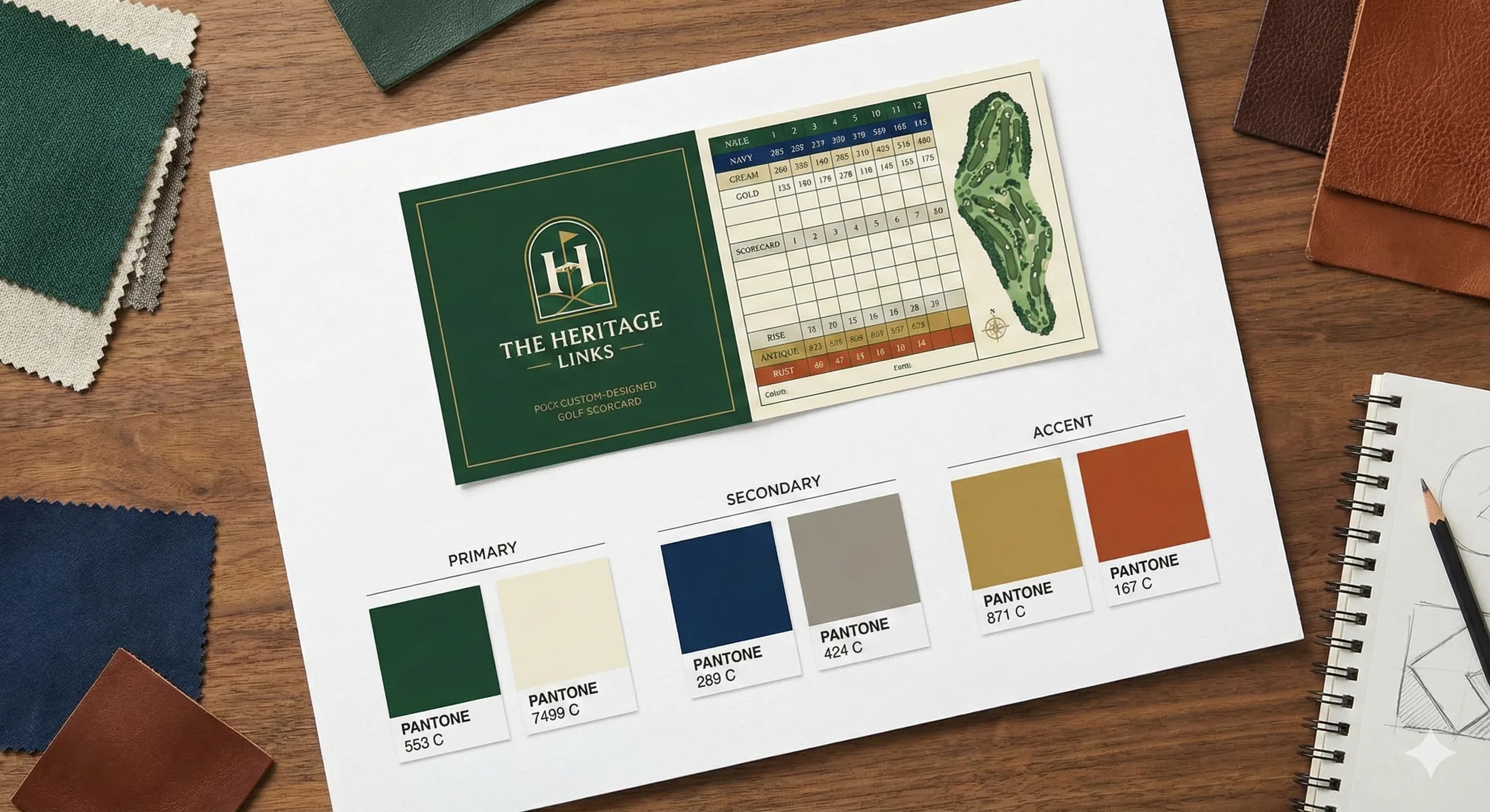
The 60-30-10 Rule
A proven formula for balanced color distribution:
- 60% Dominant Color: Main brand color - background, large areas
- 30% Secondary Color: Supporting color - headers, accents
- 10% Accent Color: Pop of contrast - highlights, calls to action
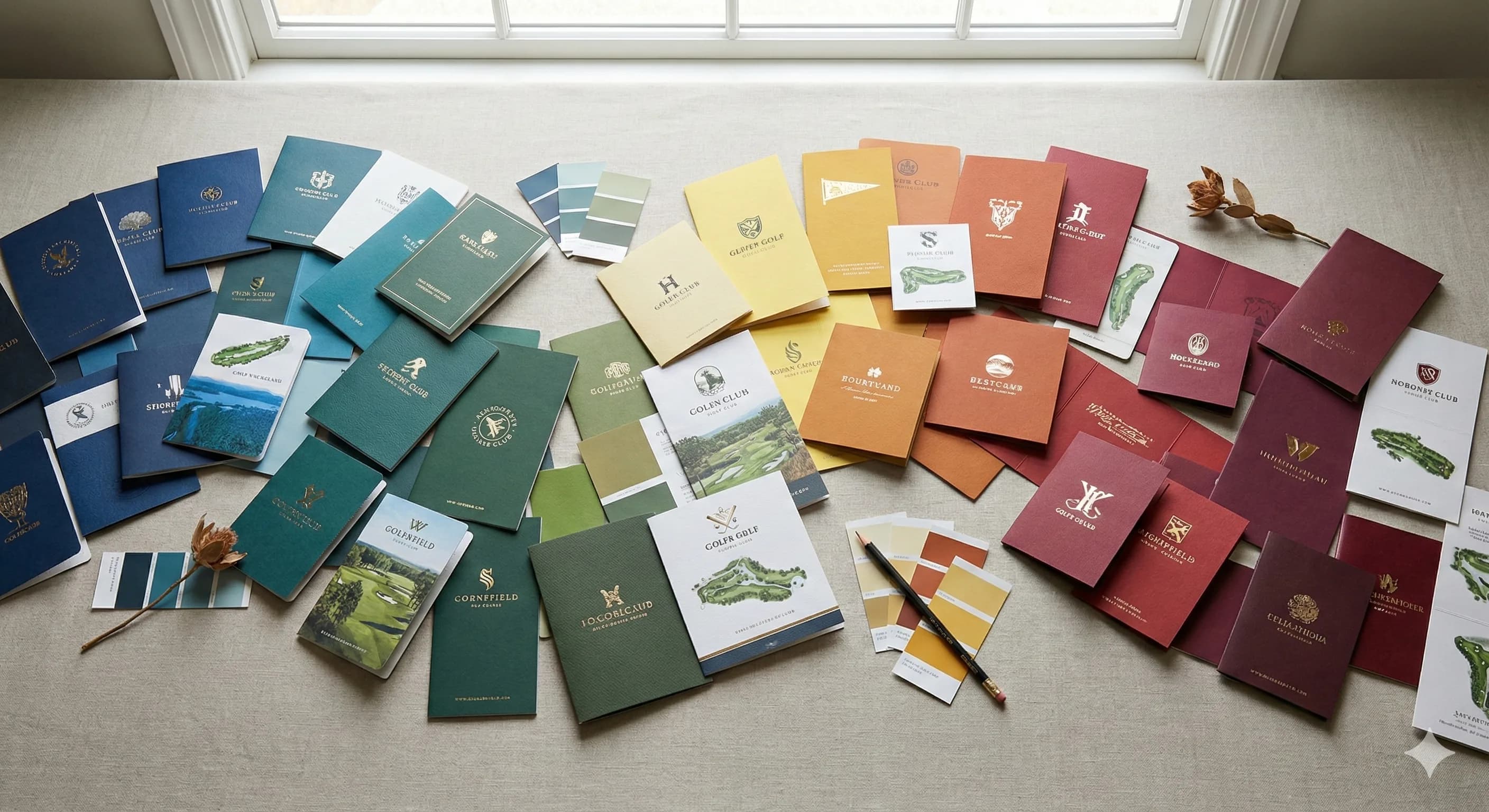
Classic Color Schemes
- Monochromatic: Different shades of one color (various greens from sage to forest)
- Analogous: Adjacent colors on wheel (green, blue-green, blue) - harmonious, natural
- Complementary: Opposite colors (green and red accents) - vibrant, high energy
- Triadic: Three evenly spaced colors (green, orange, purple) - balanced, dynamic
Competitive Differentiation
Your color palette should help you stand out from neighboring courses while remaining appropriate for golf.
Market Analysis
- Survey competitor color schemes in your area
- Identify oversaturated color combinations to avoid
- Find unique angles within traditional palettes
- Consider regional color preferences and expectations
Unique Positioning Strategies
- Heritage Focus: Deep, rich traditional colors suggesting history
- Modern Approach: Clean, minimalist palettes with bold accents
- Location-Based: Colors reflecting your unique landscape
- Signature Color: Own an unexpected accent that becomes your calling card
Common Color Mistakes to Avoid
Learn from common pitfalls in golf scorecard color selection:
- Too Many Colors: More than 3-4 colors creates visual chaos and looks unprofessional
- Poor Contrast: Difficult to read in bright sunlight - function must come first
- Trendy Over Timeless: Fashion colors date quickly; classic palettes endure
- Ignoring Context: Colors that clash with your course environment or architecture
- Inconsistent Application: Different shades across materials weakens brand recognition
- Cultural Insensitivity: Research color meanings in cultures represented in your membership
- Forgetting Paper Impact: Colors look different on various paper stocks and finishes
- Ignoring Accessibility: Designs that exclude colorblind golfers
Implementation Tips
Successfully implementing your color psychology insights requires careful application across all touchpoints.
Consistency Across Materials
- Maintain exact color standards using Pantone references for print materials
- Account for color variations between digital screens and printed output
- Create brand guidelines documenting exact color values (CMYK, RGB, Hex)
- Test colors on different paper stocks before committing to large orders
Testing and Validation
- Create mockups and proofs before full production
- Gather feedback from diverse player groups including older golfers
- Test readability in various outdoor lighting conditions
- Verify colorblind accessibility using simulation tools
Next Steps: Create Your Custom Scorecard
Ready to put color psychology into practice? Start designing your custom golf scorecard with the perfect color palette for your course.
Our design team can help you select colors that communicate your brand values, appeal to your target players, and ensure optimal readability on the course.
Conclusion
Color psychology is a powerful tool in golf course branding. The right palette can elevate your course's image, attract your ideal players, and create lasting emotional connections that bring golfers back season after season.
Take time to understand your audience, analyze your competition, and test your choices in real-world conditions. A well-considered color strategy will serve your course for years to come and become an integral part of your brand identity.
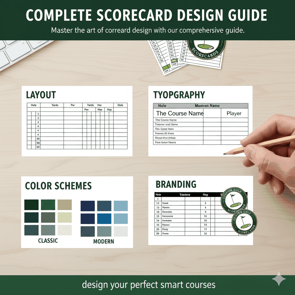
For more guidance on scorecard design, explore our Complete Scorecard Design Guide covering layout, typography, and branding best practices.